

April 15, 2026
Remini vs Natural Photo Enhancers: Which Looks More Real? (With Results)
")

Remini vs Natural Photo Enhancers: Which Looks More Real?
People usually search this question after the same disappointment. The photo does look clearer, but the skin suddenly looks waxy, the eyes feel pushed, the face stops reading like a real face, and the whole result starts announcing that it was edited. The better question is not which app looks stronger in a before-and-after. The better question is which one still feels believable after a second look. That is where natural photo enhancement usually wins.
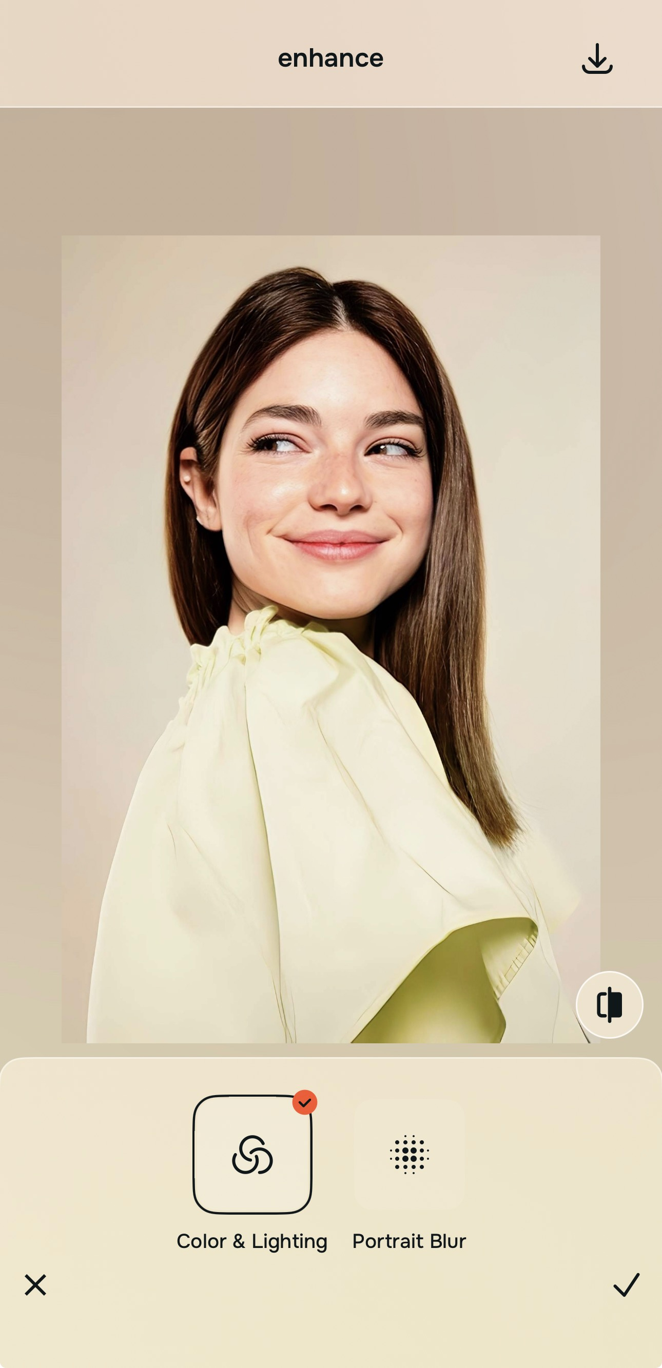
If the goal is a photo that still looks like a real person in real light, natural photo enhancers usually look more real than aggressive enhancer styles. The strongest path is to improve the whole image first, then refine the overall impression, then touch one facial issue only if it still needs help. That is why Citrus often feels more believable. It gives you Enhance for the full image, Looks for the overall finish, and Face only when one specific distraction remains.
That difference matters more than people think. A lot of users do not actually want the most dramatic enhancement. They want the photo to stop looking dull, soft, tired, or unfair. They want it to look closer to how the moment felt.
That is exactly why searches around natural-looking results, believable skin, real selfie edits, and subtle face enhancement keep growing. Once a tool starts imposing a style instead of repairing the photo, trust drops fast.
What usually makes one result feel real and another feel processed
The fastest way to lose realism is to confuse detail with quality. A natural-looking enhancer usually respects the original face shape, keeps some softness where softness belongs, and restores balance across the whole frame. An overcooked enhancer often pushes texture, contrast, and facial emphasis too early. That can make a result look impressive for one second and artificial after that.
- Skin texture gets replaced with a polished layer that no longer reads like real skin
- The face gets more attention than the photo itself, so everything starts looking edited instead of corrected
- Sharpness and contrast get pushed hard enough to make the image feel synthetic
- Most photos get steered toward one finish, even when the capture problem was different
- Start with the whole image when the real problem is weak light, softness, or low energy
- Use overall polish before touching one feature or one face detail
- Save specific face corrections for the end so the photo can stay human
- Stop as soon as the result looks fairer, not more intense
Readers coming from real face enhancer searches are usually trying to escape that processed look. They are not chasing a transformation. They are trying to recover a version of the image they can actually trust.
Test the same photo with a more natural workflow. You usually know in seconds whether the image still feels like you.
How to compare a strong enhancer to a natural one without getting fooled by drama
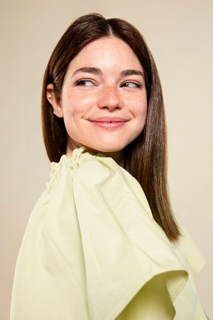
Choose a photo that matters enough to keep, but currently looks weaker than real life
Start with the picture you would actually want to post, save, or send if it looked better. Maybe the light is weak. Maybe the face feels slightly flat. Maybe the skin looks tired, or the whole capture just came out more lifeless than the moment felt.
That is the best comparison photo because it forces the enhancer to solve a real problem instead of manufacturing a flashy before-and-after. It is the same logic behind better-looking photos searches. People want recovery, not distortion.
Let the first preview load fully before deciding the face needs stronger editing
A lot of photos that look “bad” are really suffering from overall image weakness. Light is off. Balance is off. Contrast is low. The frame has less life than the real moment. That means a natural preview often improves trust before any facial change is even necessary.
This is the exact mistake many people make when comparing enhancers. They judge speed of impact instead of realism. A loud enhancer can look impressive instantly. A better enhancer often looks calmer first, then wins once you actually look at skin, eyes, hair, and facial edges.

Go to Enhance first when the whole photo looks weak, soft, dull, or unfair
This is the most important discipline in the whole comparison. If the photo problem is overall quality, stay with the overall image. In Citrus, that means Enhance. Use Colors & Lighting when the frame needs better balance and life. Use Portrait Blur when it is a portrait and the subject needs cleaner separation from the background.

For overall quality problems, always begin in Enhance. That keeps the fix attached to the real issue instead of turning the face into the issue.
That sequence is also why natural tools tend to win in searches around clear again without fake and believable photo cleanup. They work on the photo first.
Use Looks when the image is technically better but still needs a stronger overall impression
This is where many comparisons go wrong. People jump from one aggressive enhancer straight into face editing, even when the photo really just needs a better finish. In Citrus, Looks is the right move when the photo already feels cleaner but still needs a more attractive overall impression.
That keeps the edit broad and controlled. It also helps avoid the strange feeling some enhancer results create, where the face gets heavily treated even though the actual weakness was more atmospheric than structural.
Only go into Face if one specific issue still distracts from an otherwise believable result
This is where a natural enhancer usually separates itself from a louder one. Face corrections should be late-stage and specific. If one thing still bothers you, maybe tired eyes or one localized issue, then Face makes sense. If you enter Face too early, the edit starts steering the entire photo around one feature.
The best result is the one that feels easy to believe. That is why users looking for unblur a face and face clarity help often end up preferring a restrained workflow. It keeps the subject human.
What usually breaks realism for you in enhanced photos?
Pick the one that sounds closest. The best starting point changes depending on whether the problem is overall quality, overall impression, or one specific face distraction.
Remini versus a natural enhancer workflow in real-life use
A lot of comparisons in this category get trapped in the wrong test. They reward the tool that changes the photo more, not the tool that keeps the result credible. That is why it helps to compare by outcome, not intensity. If the goal is a photo that still reads like the same person under better conditions, restraint matters more than force.
| What usually matters most | Natural enhancer path | What often goes wrong with heavier enhancer styles |
|---|---|---|
| Improves the full image before pushing the face | ✓ | Sometimes the face gets emphasized too early while the frame itself still feels weak |
| Keeps some natural softness where softness should stay | ✓ | Texture and sharpness can get pushed until skin stops reading naturally |
| Lets overall polish happen without forcing one feature change | ✓ | Edits can collapse toward one dramatic look instead of adapting to the photo |
| Saves face corrections for late-stage cleanup | ✓ | Facial editing can begin too early, which makes the whole result feel processed |
| Works better for readers who want realism, not makeover energy | ✓ | The result may win on intensity but lose on believability |
| Feels safer for selfies, portraits, and everyday photos | ✓ | Can look impressive in isolation but less trustworthy when you look at the whole face |
This is why users who start with blurry pictures, weak selfies, tired portraits, or flat phone photos often end up preferring the quieter result. A believable edit tends to age better. You can post it, keep it, and look at it again later without feeling like the app took over.
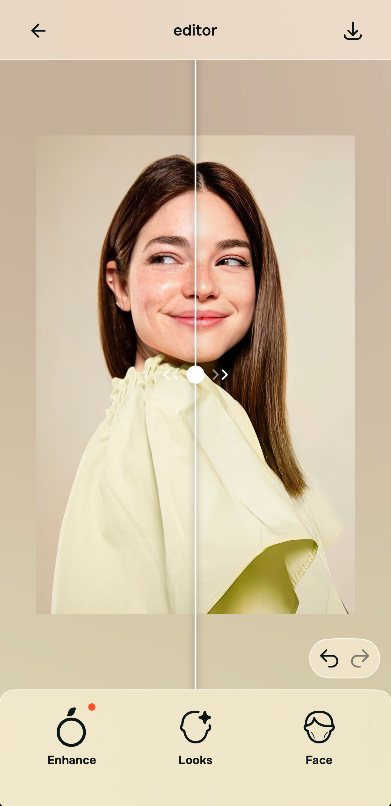
Which Citrus tool does what for this kind of photo comparison
The easiest way to stay natural is to match the tool to the real problem. That keeps the workflow simple and prevents the edit from overreaching.
| Tool | What it helps fix | When to use it |
|---|---|---|
| EnhanceStart here | Overall softness, weak light, low-energy color, messy portrait separation, or a full image that feels less alive than the real moment | Use this first when the problem belongs to the entire photo. Choose Colors & Lighting for balance and life, or Portrait Blur when the portrait needs cleaner subject separation. |
| Looks | A photo that is already cleaner but still needs a stronger overall impression or a more attractive finish | Use this after Enhance when the image needs broad polish without forcing one specific facial correction. |
| Face | One remaining localized distraction such as under-eye heaviness or another specific feature issue | Use this last, only after the photo already feels believable. It works best as a precise correction, not as the main engine of the edit. |
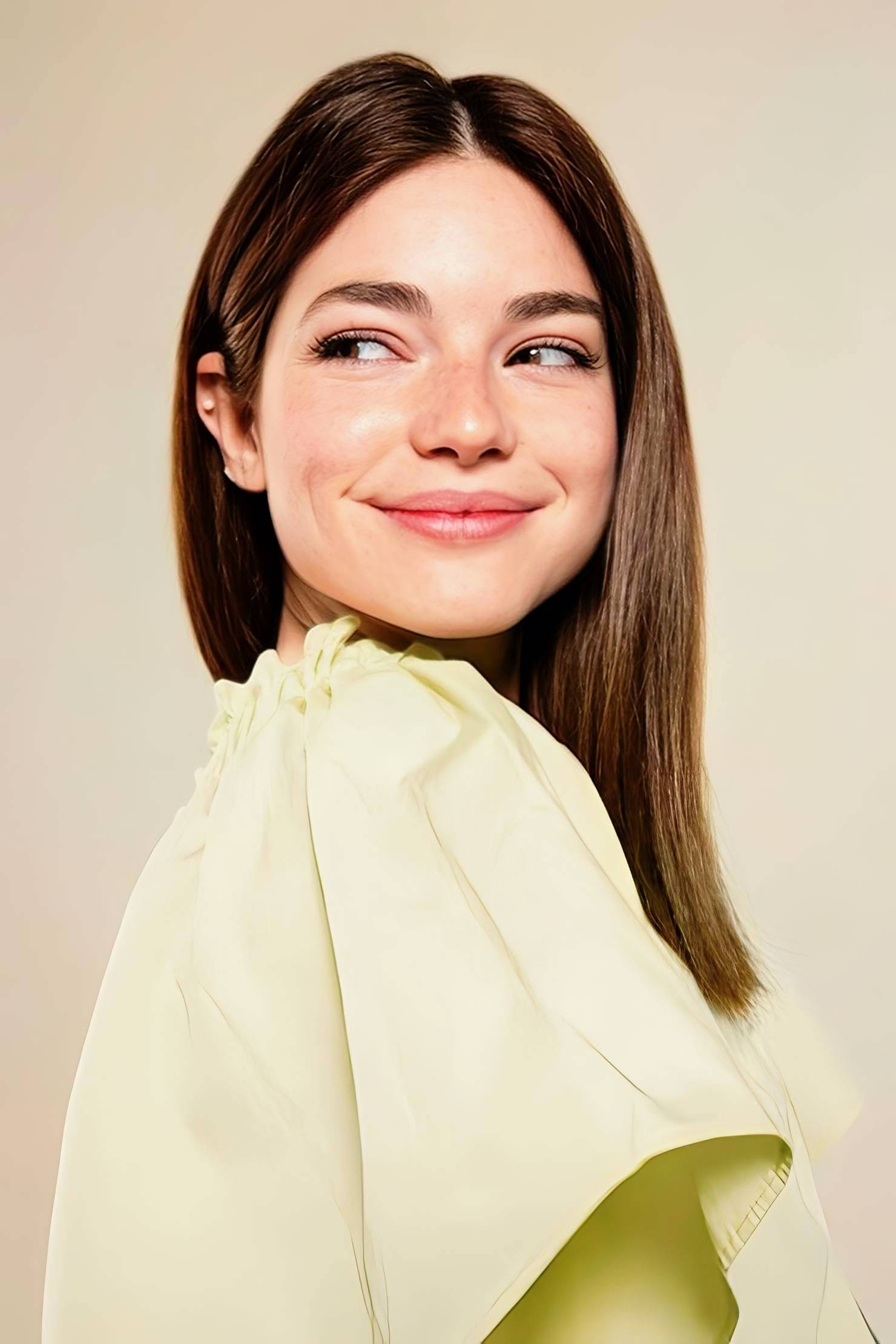
“The result that looks more real is usually the one that solved the photo first and left the face alone until it truly needed help.”
Why natural photo enhancers usually win once realism becomes the priority
The problem with dramatic enhancement is that it trains the eye to look for impact instead of truth. That is useful for flashy previews. It is not useful for photos people actually want to keep. Once the editing starts announcing itself, the improvement becomes harder to trust.
A natural enhancer fits the way most real photo problems actually happen. Phone images come out soft. Selfies flatten. Indoor light drains the skin. Portraits lose subject separation. A face can look a little more tired, a little less alive, or a little less balanced than it did in real life. Those are not makeover problems. They are capture translation problems.
That is why a calmer workflow tends to feel smarter. Start with the full image. Improve the overall impression. Correct one detail only if the result still needs it. That order does more than protect realism. It also helps the user stop earlier, which is often the moment the photo looks best.